Australian spring light is unforgiving. Colours that looked soft in a change room read much brighter outdoors, and a print that seemed subtle indoors can take over completely in full sun. That is worth knowing before you buy, because it is the reason a lot of spring purchases end up unworn.
Start with the colours near your face
The colour that matters most is the one at your neckline. Anything sitting there reflects up onto your skin, which is why the same dress can look either fresh or draining on two people. A simple test in daylight: hold the fabric under your chin at a window. If your face looks more tired than it did a second ago, the colour is not working, whatever the label says.
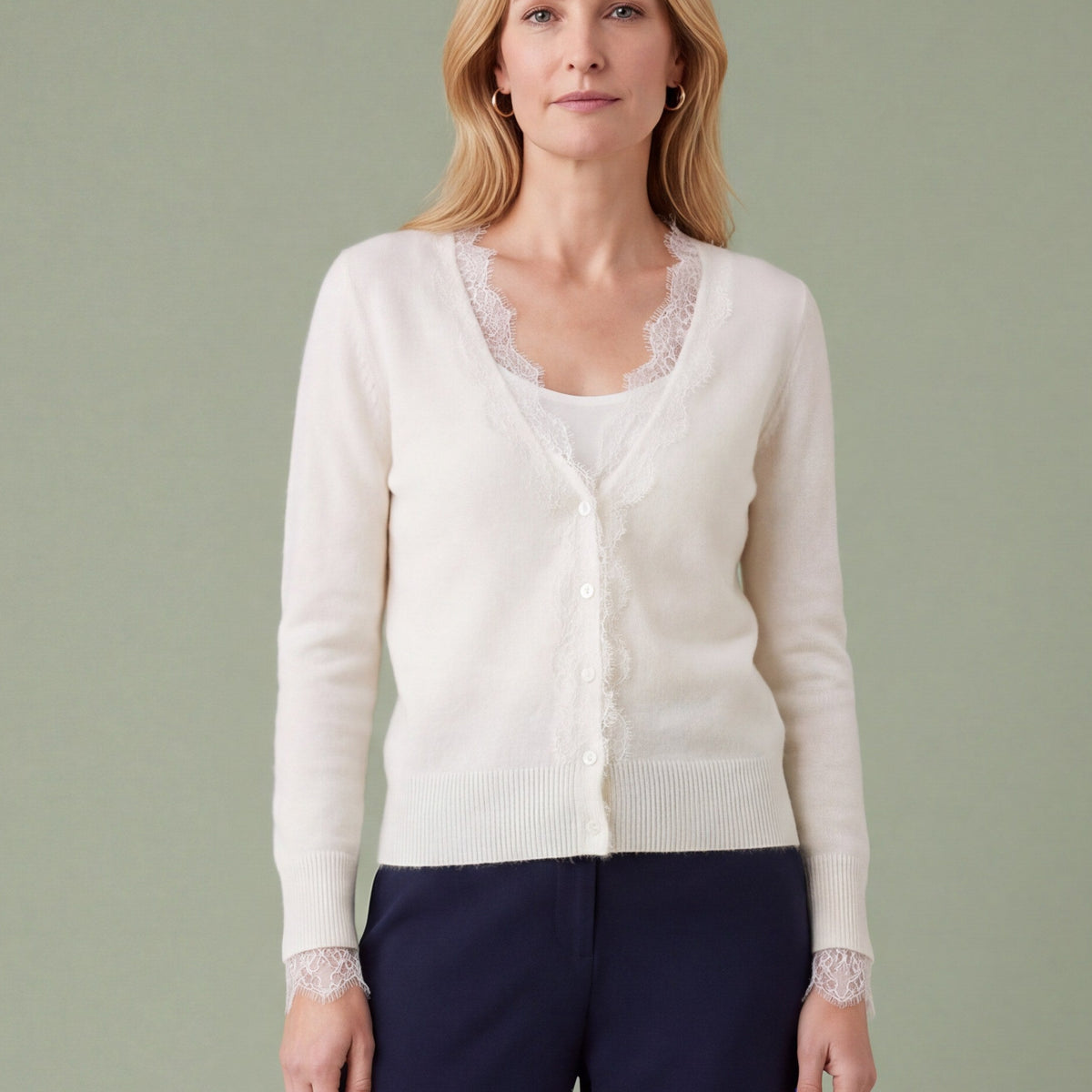
Colours that behave well in strong daylight for most people: dusty blue, sage and olive, warm cream, soft rust, navy and deep green. The ones that ask for more care are acid yellow, bright orange and pure white, which all bounce a lot of light upward.
Where to put your brightest colour
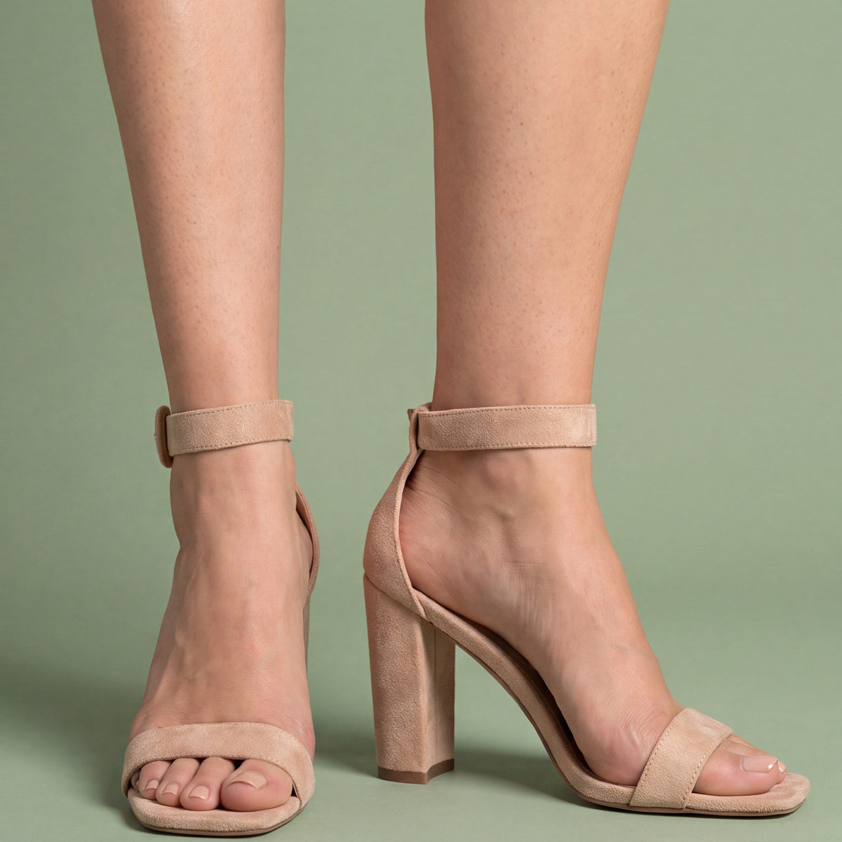
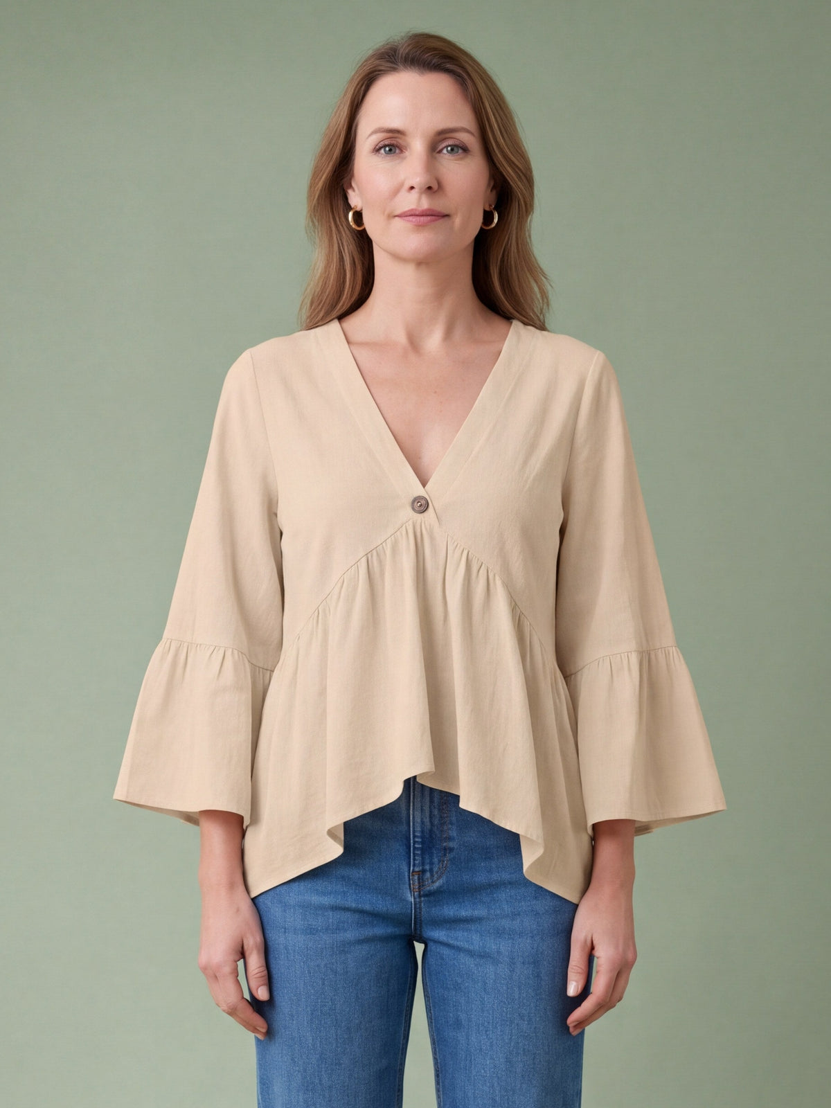
If you love a bright shade but not next to your face, put it below the waist or on your feet. A neutral dress with brightly coloured sandals is a much easier outfit than the reverse, and it still reads as a spring outfit. See tops and blouses for neutral upper halves and dresses for the neutral base.
Print scale, not print type
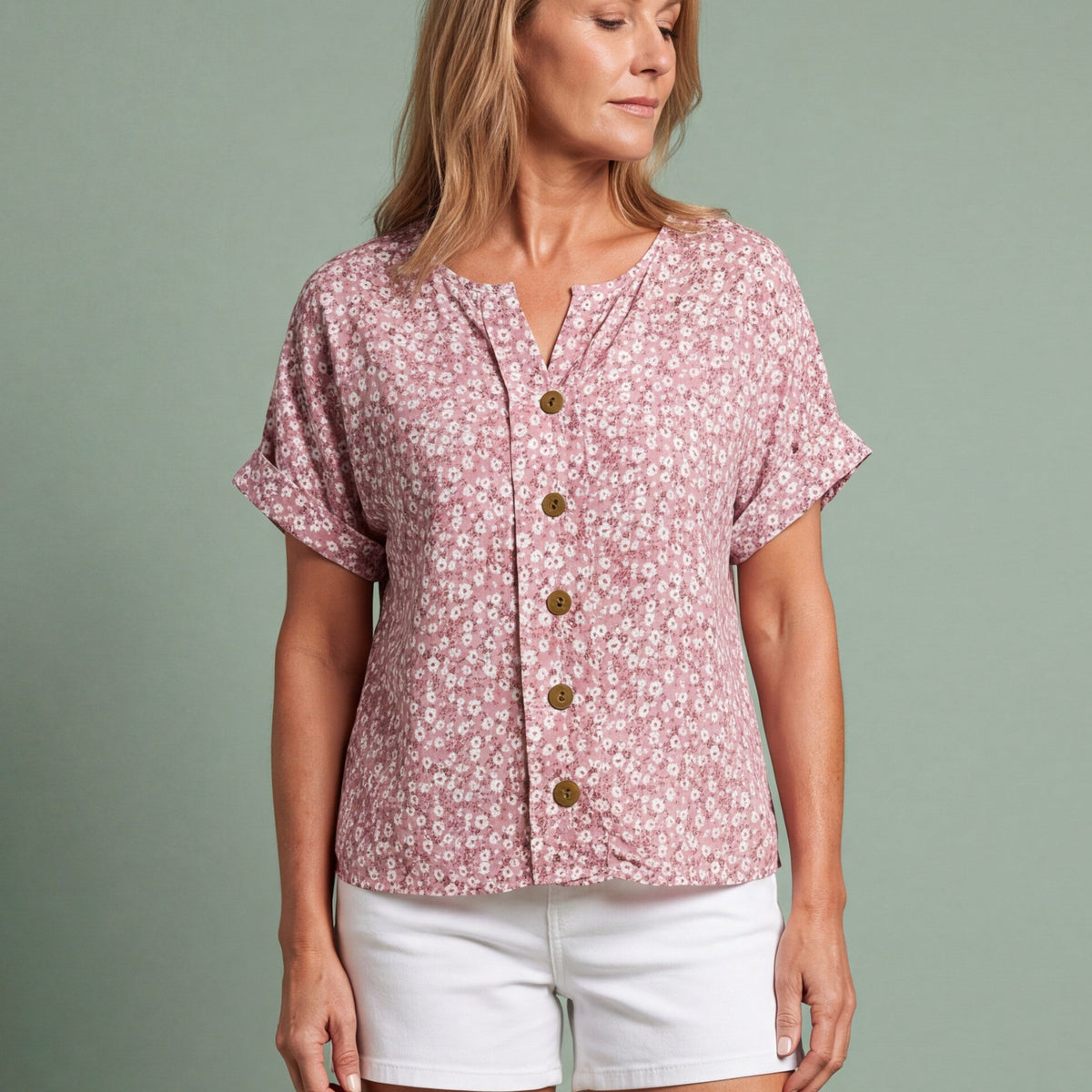
The debate about florals after fifty misses the point. The variable is scale, not subject. A small, dense print reads almost as a texture from a distance and is the safest choice. A large print reads as a statement and works best when it has clear space between the motifs. What does not work well is a medium print at medium contrast across a full body of fabric, which turns into visual noise.
Two more practical notes. A vertical or diagonal repeat sits more comfortably than a horizontal one. And a print hides creases, marks and the effects of a long day out, which is why it earns its place in a spring wardrobe. Browse Spring Season to see the scales side by side.
Two colours, not five
The fastest way to look put together in spring is to build an outfit from two colours plus one metal. Neutral base, one colour, gold or silver in the jewellery and the shoe. A matching two-piece set does this for you, which is part of why sets photograph so well.
Common questions
What colours suit women over 50 in spring?
Mid-tones and slightly muted versions of bright colours generally sit better in strong light than either pastels or neons. But the daylight test at your own neckline beats any list, because it accounts for your skin and hair rather than your age.
Can I wear a floral print in my fifties?
Yes. Choose the scale deliberately: small and dense for an everyday dress, large and well spaced for an occasion piece. Both work, a busy medium print rarely does.
Is white a good choice for spring?
It is cool and crisp, but hold it up to the light before buying and keep a slip for anything fine. Cream and warm off-white are easier to wear all day. More on fabric behaviour in choosing summer dresses for hot weather, and on building the outfit in the spring outfit guide.